Container Component
Form
Related Links: How to Add a Component | How to Modify a Component | Editing Basics | Form ComponentForm Input Components
Form input components include: button, checkbox, password, radio, select, textbox, and textarea. Once you have created your form, you must create and designate a form processor that will handle the form information that visitors will fill out.
-
form button
checkbox
password field
radio button
item select
text box
text area
image validation
Form Button

Specify the name of the form input component in the field "Field Name" ñ this name has uses of which Javascript and HTML can work with. The text on the button itself would be placed in the field "Text on Button".
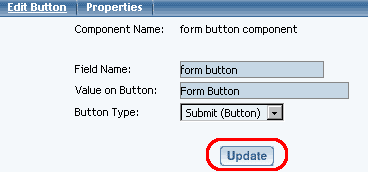
Select the button type under the drop-down menu next to the text "Button Type". You will be able to choose from "Print", "Reset", "Submit (Button)" and "Submit (Image)".
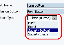
-
If the option "Print" is selected, you will be able to select an image to use for your button by clicking on the blue text next to the drop-down menu. If you do not choose an image, the system will request the generic form button and the words inputted in the field "Value on Button" will be used. When a customer clicks on this button, their computer will bring up the print dialog and will attempt to print the page.
The "Reset" option will cause the button to clear and reset all of the form fields. The generic form button with the words inputted in the field "Value on Button" will be used.
The "Submit (Button)" option will cause the button to submit all of the contents of the form component to the form processor. The generic form button with the words inputted in the field "Value on Button" will be used.
If the option "Submit (Image)" is selected, you will be able to select an image to use for your button by clicking on the blue text next to the drop-down menu. If you do not choose an image, the system will request the generic form button and the words inputted in the field "Value on Button" will be used. When a customer clicks on this button, all of the contents of the form will be submitted to the form processor.
Back to Form Input Components
Back to the Top of the Page
Checkbox

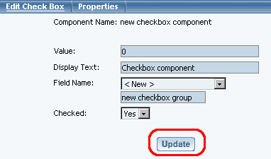
The field "Value" will assign a value to the checkbox component that will get sent to you when the form gets submitted.
Enter in the text you would like to display next to the checkbox in the field "Display Text". The text here will appear to the right of the checkbox.
By default, the field "Field Name" of the form input component checkbox is set to the name of the form input component. If you build multiple checkboxes that are associated as a group, you will want to make sure that you are using the same "Field Name". To specify your own, you would select "< New >" in the drop down list and then type in the group name for the checkboxes in the blue text field provided.
If you would like to have the checkbox automatically checked when the visitor views the page, select "Yes" in the drop-down menu next to the text "Checked".
When you are done specifying your options for the form input component, you must click on the button "Update" to save and apply your changes to the Web page.
Back to Form Input Components
Back to the Top of the Page
Password Field
The Password form input component acts like a text field, but the input text is rendered in such a way as to hide the characters (that is, as a series of asterisks). This form input component is often used for sensitive input such as passwords.

Please keep in mind that this mechanism affords only light security protection. Although the field is masked from casual observers to the Web site, the field is still transmitted to the server as clear text and may be read by anyone with low-level access to the network.
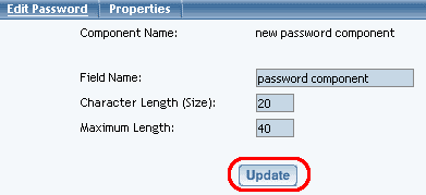
Specify the name of the form input component in the field "Field Name" ñ this name has uses of which Javascript and HTML can work with.
Specify the size of the text field that a Web site viewer would enter in their sensitive information in the field "Field Size". Specify the maximum size of the text field in the field "Maximum Length".
When you are done specifying your options for the form input component, you must click on the button "Update" to save and apply your changes to the Web page.
Back to Form Input Components
Back to the Top of the Page
Radio Button

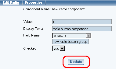
The field "Value" will assign a value to the radio component that will get sent to you when the form gets submitted.
Enter in the text you would like to display next to the radio button in the field "Display Text". The text here will appear to the right of the radio button.
By default, the field "Field Name" of the form input component radio button is set to the name of the form input component. If you build multiple radio buttons that are associated as a group, you will want to make sure that you are using the same "Field Name". To specify your own, you would select "< New >" in the drop down list and then type in the group name for the radio buttons in the blue text field provided.
If you would like to have the radio button automatically selected when the visitor views the page, select "Yes" in the drop-down menu next to the text "Checked".
When you are done specifying your options for the form input component, you must click on the button "Update" to save and apply your changes to the Web page.
Back to Form Input Components
Back to the Top of the Page
Item Select
The Select Form Input Component allows you to add a field on to the Web page where a Web site visitor would be able to select an option among many. The field would either appear as a drop-down menu or as a multiple-select menu.
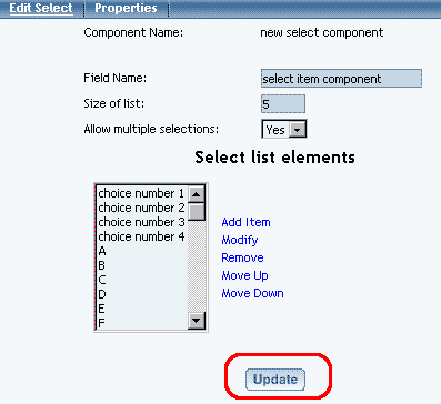
Specify the name of the form input component in the field "Field Name" ñ this name has uses of which Javascript and HTML can work with.
Indicate how many options you want to display in the field "Size of list". If you enter "1", then the Select form input component will display as a drop-down menu;

...otherwise, it will appear as a box with a list of text.

Scrollbars will be added to allow Web site visitors to see the additional options if there are more options than is allowed to display.
In the field "Allow multiple selections", you would specify whether you would want a Web site visitor to select more than one option. More than one option can be selected by holding down the CTRL key on the keyboard and clicking on multiple options. If this option is set to "Yes" and the option "Size of list" is set to "1", it will be very difficult for Web site visitors to select additional options.
To add options to the select form input component, click on the blue text "Add Item". A new pop-up window will appear. Enter in the text to display as an option in the field "Choice" and enter in the value of the option under the field "Value". If you want the option to be selected, checkmark the box "Selected". When done entering information, click on the button "Add".
If you click on an option, you can modify, remove, move up, and move down the option by clicking on the blue text that would correspond to the action you would like to perform on the option.
When you are done specifying your options for the form input component, you must click on the button "Update" to save and apply your changes to the Web page.
Back to Form Input Components
Back to the Top of the Page
Textbox

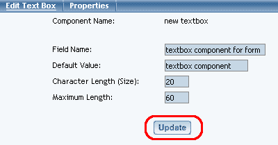
Specify the name of the form input component in the field "Field Name" ñ this name has uses of which Javascript and HTML can work with.
If you want text to automatically display in the textbox form input component, specify that text in the field "Default Value".
You can specify the size of the textbox form input component under the field "Character Length (Size)" and you can specify the maximum number of characters that a Web site visitor may type under the field "Maximum Length".
When you are done specifying your options for the form input component, you must click on the button "Update" to save and apply your changes to the Web page.
Back to Form Input Components
Back to the Top of the Page
Textarea
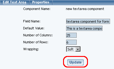
Specify the name of the form input component in the field "Field Name" ñ this name has uses of which Javascript and HTML can work with.
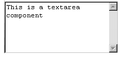
If you want text to automatically display in the textarea form input component, specify that text in the field "Default Value".
Specify the dimension of the textarea form input component to display on the page using the field "Number of Columns" as the width and the field "Number of Rows" as the height. Typed text that exceeds the textarea's dimensions will cause the scrollbars to appear so that you can scroll up and down the textarea. The textarea will accept virtually an unlimited amount of characters.
If you want the textarea to wrap text, select either "Hard" or "Soft". Hard will automatically cause the text to wrap if the number of characters in a word exceeds the column width. Soft will also do so, but will try to keep the whole word together.
When you are done specifying your options for the form input component, you must click on the button "Update" to save and apply your changes to the Web page.
Back to Form Input Components
Back to the Top of the Page
Image Validation

The Image Validation component can be used to prevent automated spammers from submitting forms through your site. After you've added the component, it will appear as an image with random letters and numbers. Each visitor will see a different set, and cannot submit the form unless the correctly enter what they see on the page.
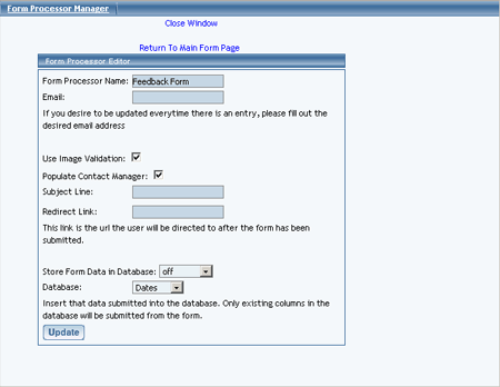
After adding the Image Validation component, you will need to go to the Form Processor Manager and check the box for Use Image Validation
Editing Basics
Back to the Previous Page